
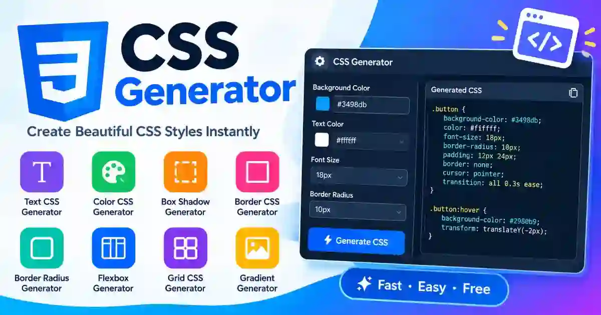
Every web page needs CSS, the code that sets colours, spacing, borders, shadows and layout. Writing it by hand is slow when you only want to see how a shadow or a gradient will look.
A CSS generator lets you set the look first and copy the code afterwards. Whether you need a quick border, a layered shadow or a full gradient background, it saves you from guessing values. The tools in this category run in your browser, so there is nothing to install.
CSS stands for Cascading Style Sheets. A rule has a selector, which says what to style, and declarations, which say how. For example, a rule can give a button rounded corners and a soft shadow.
A generator turns that into a visual job. You move sliders, pick colours and watch a live sample change. The tool then writes the matching declarations, so you never have to remember exact property names or value order.
Each tool builds one kind of effect. The table shows what each one does best.
| Task | Use It When |
|---|---|
| CSS Gradient Generator | You want a background that fades from one colour to another |
| CSS Box Shadow Generator | You want depth and soft edges around a card or button |
| CSS Border Radius Generator | You want rounded corners on buttons, cards or images |
| Glassmorphism CSS Generator | You want a frosted-glass panel over a background |
| CSS Clip Path Generator | You want a shape cut from a box, such as a triangle or a polygon |
| CSS Background Pattern Generator | You want a repeating pattern behind a section |
Most visual effects come down to a handful of properties. A gradient fades colour from one shade to another. A box shadow adds depth and soft edges around an element. Border radius rounds corners. A glassmorphism panel adds blur and a faint border so a card looks like frosted glass. A clip path cuts a box into a shape. A background pattern repeats a small design across a section.
A good generator shows each change as you make it, so you learn what every value does while you build. Each preview becomes a small lesson in how CSS works.
Open the generator you need from this category. Choose your options, such as colours, sizes and spacing. Watch the preview and adjust until it looks right. Copy the generated code, then paste it into your stylesheet or theme settings.
After pasting, check the result in a browser. Your own page may already have rules that change how the new code behaves, so a quick look at the live page is part of the job.
The right place depends on your site. In WordPress, use the Additional CSS box in the Customizer, which keeps your changes safe when the theme updates. In your own stylesheet, add the rule to your main .css file and link it once in the page head. For a single page or a quick test, place the code inside a style element.
Generated code is a starting point, and a few habits keep your stylesheet tidy. Give each style a clear class name so you can find it later. Keep only the properties you need and delete the rest. Prefer relative units such as rem and percentages for text and widths, because they scale better on small screens.
Use colour pairs with strong contrast so text stays easy to read. Test on a phone, since most visitors arrive on one, and test the hover and focus states of buttons and links, not just their resting state.
Pasting the same rule many times instead of reusing one class makes a stylesheet hard to maintain. Fixed pixel widths overflow on narrow screens. A shadow or gradient so strong that it hides the content defeats its own purpose. Forgetting to test at several screen widths leaves surprises for phone visitors.
A page should look right on a phone, a tablet and a desktop. Flexible layouts and sensible units do most of that work, and media queries handle the exceptions. Treat every generated block as something to test at several screen widths.
Beginners see the code that matches each visual choice, which makes learning faster. Designers test an idea quickly without waiting for a developer. Developers skip repetitive syntax and keep the focus on logic. Site owners make small style fixes on a WordPress or other site without hiring help.
Yes. There is no account and no payment. Adjust the options, copy the code and use it in your site.
No. You pick colours and move sliders, and the tool writes the code. Knowing a little CSS helps you tidy the result, but it is not required to get a working style.
The properties these tools generate are widely supported in modern browsers. Very old browsers may ignore newer effects such as backdrop blur. Test your page in the browsers your visitors actually use.
Your own stylesheet may already have rules for the same element, and those rules can override the new ones. Check for conflicts, and make your selector more specific if another rule is winning.
Yes. The output is plain CSS that you can read, edit and own. Paste it into a stylesheet, a theme setting or a style tag, wherever your site keeps its styles.
Styling is faster when you can see it. Set the look, copy the code, paste it where your styles live, and check it on a phone. These generators take the guessing out of values, so the time goes to the design instead of the syntax.