
CSS Box Shadow Generator Easy Shadow Effect
CSS Box Shadow Generator is a high-performance visual design tool created to help developers and UI designers craft the perfect depth for their web elements. Shadows play a vital role in modern user interfaces by creating a sense of hierarchy and elevation. Instead of manually writing complex code, you can use our instant generator to see changes in real-time. Whether you are building a simple card or a complex dashboard, our tool ensures your code is clean and production-ready. Visual depth helps users distinguish between the background and the interactive elements, improving usability significantly.
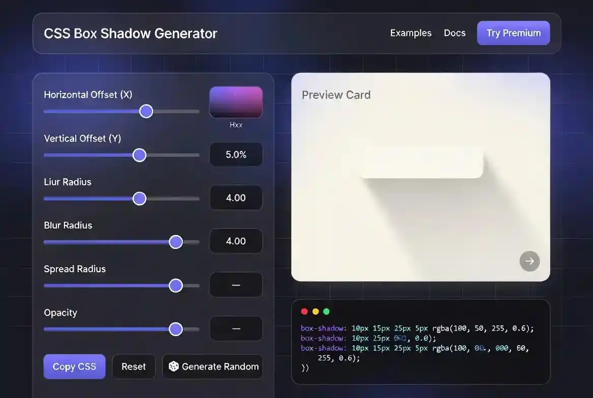
Introduction to the CSS Box Shadow Generator
Designing modern websites requires a deep understanding of visual depth. Our CSS Box Shadow Generator is engineered to help you achieve that depth without writing a single line of manual code. In the early days of web design, shadows were often created using heavy image files. Today, we use the CSS `box-shadow` property, which is infinitely more efficient and faster to load.
Using a visual tool allows you to experiment with different “elevation” levels. For instance, a small blur radius makes an element look like it is resting on the surface. A large blur radius combined with an offset makes it appear as if the element is floating high above the page. This flexibility is essential for creating complex user interfaces that feel intuitive to the user.
This CSS Box Shadow Generator is compatible with all modern browsers. It outputs standard CSS syntax that you can simply copy and paste into your style sheet. Whether you are working on a light mode or dark mode theme, the color picker and opacity sliders give you total control over the visual output, ensuring accessibility standards are met.
How to Use the CSS Box Shadow Generator Tool
Mastering our tool is incredibly simple and requires no previous coding knowledge. First, use the Horizontal and Vertical sliders to position the shadow. Positive values move the shadow right and down, while negative values move it left and up. This is the foundation of creating a light source direction for your interface that mimics real-world physics.
Next, adjust the Blur Radius. A higher blur value creates a softer, more diffuse shadow that looks natural and high-end. The Spread Radius slider allows you to expand or contract the shadow’s size beyond the element’s actual dimensions. This is a pro-tip for creating “glow” effects or very subtle layering that adds a touch of elegance to your buttons and cards.
Finally, select your color and opacity. Most designers use a dark color with low opacity for a realistic feel. Don’t forget to try the “Inset” checkbox if you want the shadow to appear inside the box rather than outside. This CSS Box Shadow Generator makes the entire process intuitive, allowing you to focus on the creative side of web development.
CSS Box Shadow Generator Performance Optimization
While shadows look beautiful, they can impact browser performance if not handled correctly. Large blur radii or complex layered shadows require the browser’s GPU to work harder during the “paint” phase. This is why our CSS Box Shadow Generator provides clean, optimized code that avoids unnecessary rendering lag. It is better to use multiple subtle shadows than one giant, heavy blur.
Mobile devices have limited processing power compared to desktops. When designing for mobile-first environments, keep your shadow values moderate rather than copying desktop-scale blur and spread numbers straight onto a phone layout. A shadow that reads as subtle on a large monitor can look heavy and sluggish on a mid-range phone’s GPU, so it’s worth testing your generated values on an actual device, not just a resized browser window.
If you are developing a dashboard with hundreds of cards, consider applying shadows only on hover states. This reduces the initial load time and keeps the scrolling smooth. Our CSS Box Shadow Generator lets you test these hover values instantly so you can implement performance-friendly styles without sacrificing the “wow factor” of your web application.
CSS Box Shadow Generator for Neomorphism and Soft UI
Neomorphism is a design trend that relies almost entirely on the clever use of shadows. It creates a soft, extruded look where the element seems to be part of the background. To achieve this, you typically need two shadows: one light shadow on the top-left and one dark shadow on the bottom-right. Our CSS Box Shadow Generator helps you find those exact hex codes and offset values.
Soft UI designs are particularly popular in finance and health apps. If you are building a tool like an EMI calculator or a BMI calculator, a soft neomorphic style can make the inputs feel tactile and modern. Users love interfaces that look like physical objects they can touch and interact with.
Remember that Neomorphism requires high contrast between the shadows to work properly. Use our CSS border radius generator alongside the shadow tool to ensure your corners are rounded enough to support the soft UI look. Sharp corners often break the illusion of extruded surfaces, so keep your radii smooth and consistent.
CSS Box Shadow Generator: Dark Mode vs Light Mode
Shadows behave differently depending on the background color. In light mode, a grey or semi-transparent black shadow works perfectly. However, in dark mode, a pure black shadow is often invisible. Designers instead use “glowing” shadows or shadows with a slight tint of the brand’s primary color. Our CSS Box Shadow Generator includes a full color picker to handle these scenarios.
When switching to dark mode, you might want to increase the opacity or shift the color toward a deep blue or purple. If you are designing a professional portal where users spend hours, like an age calculator or a scientific calculator, eye strain is a concern. Soft, colored shadows in dark mode are much easier on the eyes than harsh black lines.
Consistency between modes is vital for brand identity. You can use our glassmorphism CSS generator to create translucent layers that react to the background colors. Combining shadows with glassmorphism is a standard practice in modern OS design, such as Windows 11 and macOS, to create a premium, layered feel.
The Secret of Layered Realistic Shadows
The most realistic shadows on the web aren’t just a single line of code. They are “layered” shadows where multiple `box-shadow` properties are stacked. This mimics how light behaves in the real world, where shadows have a sharp core and a very soft outer edge. While our CSS Box Shadow Generator provides the base, you can stack its output in your CSS for maximum realism.
To create a layered shadow, you can generate a shadow with a small blur, then another with a larger blur and lower opacity. This technique is often used in high-end design portfolios and SaaS landing pages. If you are also using textures, our CSS background pattern generator can provide the perfect surface for these realistic shadows to fall upon.
Don’t be afraid to use the “Spread” property sparingly. A negative spread value can pull the shadow inward, making it look more like a “drop shadow” from a floating paper than a heavy box. This CSS Box Shadow Generator gives you the precision sliders needed to find those micro-adjustments that separate amateur designs from expert-level user interfaces.
Maintaining Shadows in Design Systems
In a large-scale project, maintaining consistency is the biggest challenge. You shouldn’t have different shadows for every single button. Instead, create a “Shadow System” with 3 to 5 elevation levels (Low, Medium, High). Our CSS Box Shadow Generator is the perfect tool to define these levels. Once defined, you can save these as CSS variables or Sass mixins for your team.
Naming matters as much as the values themselves. A variable called --shadow-card or --elevation-2 tells a developer exactly when to reach for it, while a name like --shadow-1 forces everyone to go check the design file every time. Pick a naming scheme tied to either the component (card, modal, dropdown) or the elevation level, and stick to it across the whole codebase so a new team member can guess the right variable without asking.
Revisit the system periodically rather than treating it as fixed forever. As a product grows, new components tend to need a shadow that falls between two existing levels, and the temptation is to just eyeball a one-off value. Resist that where you can: run it back through this generator, compare it against the nearest existing level, and either reuse that level or formally add a new one, so the system stays a small, deliberate set of values instead of slowly drifting into dozens of near-duplicate shadows.
box-shadow vs filter: drop-shadow(): Which One to Use
CSS actually gives you two ways to add a shadow, and mixing them up is a common source of confusion. The CSS Box Shadow Generator on this page outputs the box-shadow property, which always draws a shadow based on the element’s rectangular box, even if the element itself is a rounded avatar or an irregular SVG shape. That rectangular shadow can look wrong around non-rectangular content.
The filter: drop-shadow() property solves that problem by following the actual visible shape of the element, including transparent PNGs, SVG icons, and text. The tradeoff is performance: drop-shadow() is generally more expensive for the browser to render than box-shadow, especially when animated, because it has to analyze pixel alpha values rather than a simple rectangle. As a rule of thumb, reach for the values from this generator on cards, buttons, and panels, and save drop-shadow() for logos, icons, and cut-out images where the shape actually matters.
You can also combine both. A common pattern is a subtle box-shadow on a card’s container for general elevation, plus a small drop-shadow() filter on a floating icon or badge that sits on top of it, so each shadow matches the shape it’s attached to.
UI/UX Depth and Hierarchy Theory
The concept of “elevation” is central to modern design systems like Material Design. In this theory, the surface of the screen is 0 elevation. Every element that casts a shadow has a Z-axis value. A higher Z-axis means a more prominent shadow. This CSS Box Shadow Generator is the perfect companion for implementing these elevation rules in your code.
Creating hierarchy means showing the user what is most important. A modal window should have a very deep, soft shadow to clearly separate it from the dimmed background. A card in a grid might only need a tiny shadow. For unique layouts, you can use the css clip path generator to create non-standard shapes that still benefit from shadow-based depth.
Consistency is the secret to a great UI. If you use a 10px blur for one card, you should use it for all similar cards. Using our tool ensures that your values are consistent across your entire project. This CSS Box Shadow Generator acts as a source of truth for your styling values, ensuring that your website looks polished and professional to every visitor.
Shadows and Web Accessibility Standards
Shadows are not just about looks. They serve a functional purpose in helping users understand interface hierarchy. For users with cognitive disabilities, clear visual depth cues make it easier to identify which elements are interactive and which are decorative. A button that casts a shadow looks pressable. A card that lifts off the page looks tappable. The CSS Box Shadow Generator helps you create these cues with precision, ensuring that your shadows communicate meaning, not just style.
Color contrast requirements extend to shadows in some accessibility frameworks. A shadow that is too faint might not provide enough separation between a modal and its backdrop, causing confusion about what is currently active. WCAG guidelines focus primarily on text contrast, but the underlying principle applies to all visual differentiation. Use the CSS Box Shadow Generator to test your shadows against both light and dark backgrounds to ensure they remain visible to users with low vision.
Motion sensitivity is another consideration. Some users disable animations and transitions due to vestibular disorders. While shadows are static, their appearance during state changes can trigger discomfort if they flash or shift abruptly. The CSS Box Shadow Generator produces clean code that works well with reduced-motion preferences. Pair your shadow transitions with the prefers-reduced-motion media query to respect user settings while maintaining visual clarity.
Using Generated Shadows in CSS Frameworks
Modern development rarely happens in plain CSS. Most projects use frameworks like Tailwind, Bootstrap, or Material UI, each with its own approach to shadows. Tailwind provides utility classes like shadow-sm, shadow-md, and shadow-lg, but these are presets. When you need a custom shadow that matches your brand exactly, the CSS Box Shadow Generator becomes essential. Generate the exact values, then extend your Tailwind config with the new shadow definition.
Bootstrap uses a simpler scale with shadow-none, shadow-sm, shadow, shadow-lg, and shadow-inset. If you are customizing Bootstrap variables, the CSS Box Shadow Generator helps you find the right values for your $box-shadow variables before compiling your Sass. This prevents the trial-and-error cycle of editing, compiling, and refreshing that wastes so much development time.
Material UI takes elevation literally, mapping shadow values to z-depth levels from 0 to 24. Each level corresponds to a specific combination of opacity, blur, and offset. The CSS Box Shadow Generator lets you reverse-engineer these values or create your own elevation system that feels more natural for your specific application. Instead of fighting the framework defaults, you enhance them with custom shadows that fit your design language.
Animating Shadows for Interactive Feedback
Static shadows establish hierarchy, but animated shadows create delight. When a user hovers over a card, increasing the shadow blur and offset makes the card appear to lift toward them. This micro-interaction provides instant tactile feedback that the element is interactive. The CSS Box Shadow Generator helps you find the hover values that feel natural rather than exaggerated.
Focus states benefit from shadow animation too. Instead of the default browser outline, many designers use a colored shadow that pulses or glows when an input receives focus. This looks more polished while maintaining accessibility. Generate the focus shadow with the CSS Box Shadow Generator, then apply it through the :focus-visible pseudo-class so it only appears for keyboard users who actually need the visual cue.
Loading states can use animated shadows to indicate progress. A button that pulses with a spreading shadow tells the user that something is happening without requiring a separate spinner icon. The key is subtlety. The animation should be slow enough to feel calm but fast enough to feel responsive. Test different durations alongside your generated shadow values until the timing feels right.
Shadows in Print and Export Contexts
Web shadows do not always translate to print. Browsers often drop shadows when printing to save ink, or they render them as solid grey boxes that look muddy. If your design needs to work in both digital and print contexts, the CSS Box Shadow Generator helps you prepare fallback styles. Use the @media print query to replace complex shadows with simple borders or lighter tints that convey the same hierarchy without relying on blur effects.
PDF exports from web pages face similar challenges. Tools that convert HTML to PDF sometimes struggle with CSS shadows, producing inconsistent results. When generating design specs for print documentation, include both the shadow code and a visual screenshot. This gives print designers a reference they can recreate using their native tools if the CSS does not transfer cleanly.
Email templates are another export context where shadows behave unpredictably. Many email clients strip CSS shadows entirely or render them poorly. For marketing emails, use the CSS Box Shadow Generator to create the visual design, then export flat images of the shadowed elements for the email version. This ensures consistency across Gmail, Outlook, Apple Mail, and other clients with varying CSS support.
Common box-shadow Syntax Mistakes to Avoid
The order of values in box-shadow trips up even experienced developers. The syntax is horizontal offset, vertical offset, blur radius, spread radius, then color, in that exact order, with the optional inset keyword placed first. Swapping blur and spread by accident produces a shadow that looks subtly wrong rather than obviously broken, which makes the mistake hard to spot just by reading the code. When something looks off, load the values from this CSS Box Shadow Generator back into your stylesheet and compare them side by side with what you already wrote.
Forgetting the spread value entirely is another common slip. CSS treats a missing spread as zero, so box-shadow: 4px 4px 10px #000 is valid, but leaving it out on purpose versus by accident can make a design system inconsistent from one component to the next. It helps to always write all four length values explicitly, even when spread is 0, so the next person editing the file can see the decision was intentional rather than an omission.
A third mistake is using a solid, fully opaque color for the shadow. A pure black shadow at 100% opacity looks like a hard-edged silhouette rather than a soft cast shadow, because real light never blocks light that completely. Keeping opacity in roughly the 10 to 40 percent range, as the color and opacity controls above make easy to dial in, is what gives a shadow the soft, believable look most interfaces are going for.
Cross-Browser Testing for Shadow Consistency
Not all browsers render shadows identically. Safari tends to produce softer shadows than Chrome at the same blur value. Firefox handles spread radius slightly differently, especially with negative values. The CSS Box Shadow Generator outputs standard syntax, but visual verification across browsers remains necessary for pixel-perfect designs.
Testing tools like BrowserStack or Sauce Labs let you check shadow rendering on devices you do not physically own. Take screenshots of your generated shadows across multiple browsers and versions, then compare them side by side. Small differences are acceptable, but major discrepancies might require browser-specific adjustments using feature detection rather than user-agent sniffing.
Mobile browsers add another variable. iOS Safari uses a different rendering engine than desktop Safari, and shadows can appear heavier or lighter depending on the device’s Retina scaling factor. Test on actual devices whenever possible, not just emulators. The CSS Box Shadow Generator gives you the code, but the final polish comes from real-world testing on the devices your users actually carry.
Sharing Shadow Specifications with Teams
Design handoffs fail when shadow specifications get lost in translation. A designer might describe a shadow as soft and subtle, while a developer implements a 20px blur that looks completely different. The CSS Box Shadow Generator eliminates this ambiguity by providing exact numerical values that both sides can reference. No more guessing what soft means.
Design tokens formalize this communication. Store your generated shadow values as tokens in a system like Style Dictionary or Theo. These tokens sync across design files, code repositories, and documentation. When a shadow needs to change, update the token once and watch the change propagate everywhere. The CSS Box Shadow Generator becomes the source of truth for creating new tokens or adjusting existing ones.
Version control matters for shadow systems too. Track changes to your shadow values in Git alongside your component code. When a designer requests a softer card shadow, the pull request shows the exact numerical diff. This transparency prevents accidental regressions and makes design decisions visible to the entire team. The CSS Box Shadow Generator produces the values that feed into this disciplined workflow.
Emerging Trends in Shadow Design
Glassmorphism brought translucent shadows to the forefront. These shadows pick up color from the background beneath them, creating an ethereal floating effect. The CSS Box Shadow Generator handles the opacity and color selection, while backdrop-filter handles the blur behind the element. Together, they create the frosted glass look that dominated UI trends in recent years.
Aurora backgrounds represent another direction. These slowly shifting gradients use oversized soft shadows to create depth without hard edges. The shadows are so large and diffuse that they read as atmospheric lighting rather than object shadows. Generate the base shadow with the CSS Box Shadow Generator, then animate the color and position over long durations for a calming, immersive background.
Neon noir aesthetics use colored shadows with high saturation and tight blur. The effect feels like digital signage in a rainy city. This style works best in dark mode with deep backgrounds and bright accent colors. The CSS Box Shadow Generator’s color picker and opacity controls make it easy to dial in the exact neon intensity without washing out the surrounding interface.
Conclusion
Mastering shadows is a hallmark of an expert web developer. Our CSS Box Shadow Generator simplifies this complex property into a series of intuitive sliders and buttons. By using this tool, you save time, improve site performance, and ensure visual consistency across all your web projects. We hope this tool helps you create stunning, professional websites that stand out in the competitive digital landscape.
Don’t forget to explore our other generators for backgrounds, borders, and gradients. For example, our CSS gradient generator can add even more life to your designs. Our mission is to provide you with a comprehensive suite of free, high-quality tools to streamline your entire digital workflow. Thank you for choosing us for your design needs. Start building your modern UI today!
For more deep dives into web standards, check out the MDN Web Docs on Box Shadows. You can also explore design inspiration on Dribbble or Behance. For technical styling tips, the CSS-Tricks blog is a fantastic resource. This CSS Box Shadow Generator is just the beginning of your professional design journey.
Frequently Asked Questions (FAQ)
What is the difference between Blur and Spread?
Blur makes the shadow edges softer and more transparent. Spread actually increases the physical size of the shadow. Think of Blur as “fuzziness” and Spread as “scale.” Our CSS Box Shadow Generator allows you to adjust both independently for maximum control.
Is the box-shadow property supported by all browsers?
Yes, all modern versions of Chrome, Safari, Firefox, Edge, and Opera fully support the `box-shadow` property. For very old versions of Safari or Chrome, vendor prefixes like `-webkit-` might be needed, but our tool focuses on the modern, clean standard that search engines prefer.
Can I use multiple shadows on one element?
Absolutely! CSS allows you to comma-separate multiple shadows. While our CSS Box Shadow Generator currently focuses on a single shadow at a time, you can generate one, copy the code, and then add another with a comma in your style sheet to create complex layered effects.
How do I make a glow effect?
To create a glow, set the Horizontal and Vertical offsets to 0. Then, increase the Blur Radius and choose a bright color. This creates an even shadow all around the element, which looks like it is glowing from behind. This CSS Box Shadow Generator is perfect for creating neon and glow effects.