
A CSS Border Radius Generator saves you from the trial and error of typing pixel values by hand and reloading the page to see if a corner looks right. Move a slider, watch the preview update immediately, and copy the finished CSS when it looks the way you want.
What This CSS Border Radius Generator Does
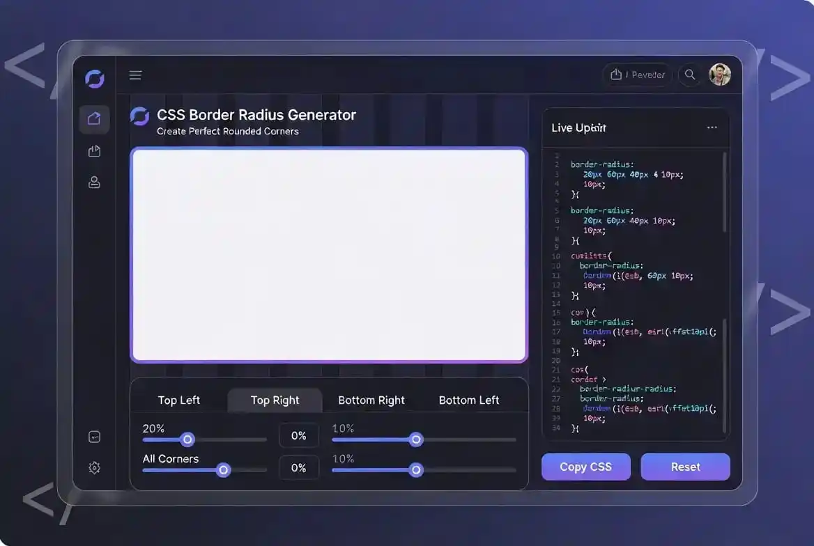
This CSS Border Radius Generator gives you four sliders, one for each corner of a box: top left, top right, bottom right, and bottom left. As you move any slider, the preview box updates instantly and the exact CSS needed to reproduce that shape appears underneath, ready to copy into your own stylesheet.
The underlying property is border-radius, part of CSS since CSS3, and it’s one of the simplest ways to soften the look of a button, card, image, or container without touching an image editor. This generator just removes the guesswork of figuring out which pixel value looks right for your specific box size.
Understanding the border-radius Property Behind This Generator
border-radius can take between one and four values, and each pattern behaves differently. A single value rounds all four corners equally. Two values set the top-left/bottom-right pair and the top-right/bottom-left pair separately. Four values, the format this tool outputs, control each corner independently in the order top-left, top-right, bottom-right, bottom-left.
Setting all four corners to 50% on a perfectly square element produces a circle, which is why this property is used constantly for avatars, profile pictures, and notification badges. On a non-square element, the same 50% instead produces an ellipse shape rather than a true circle.
Values can be in pixels, as this tool outputs, or in relative units like percentages, rem, or em. Pixel values are predictable and easy to reason about, which is why they’re the clearest starting point when you’re still deciding on a shape. Once you’ve settled on a look, converting to a relative unit is straightforward if your project needs the radius to scale with the element’s size or the user’s font settings.
Individual Corner Properties and Elliptical Corners
Beyond the four-value shorthand this CSS Border Radius Generator outputs, CSS also exposes each corner as its own dedicated property: border-top-left-radius, border-top-right-radius, border-bottom-right-radius, and border-bottom-left-radius. These longhand properties are useful when a component already has a default rounded look defined elsewhere in a stylesheet and you only need to override one corner, rather than restating all four values again.
A detail the shorthand hides is that every corner can actually take two values instead of one: a horizontal radius and a vertical radius, separated by a slash, such as border-radius: 50px / 30px. The first number controls how far the curve reaches along the top and bottom edges, and the second controls how far it reaches along the left and right edges. Equal values produce the familiar circular curve this tool draws; unequal values stretch that curve into an oval arc, which is how CSS produces true elliptical shapes without an image or an SVG.
How to Use This CSS Border Radius Generator
- Adjust each corner: drag the Top Left, Top Right, Bottom Right, and Bottom Left sliders on this CSS Border Radius Generator independently. The preview box updates live as you move each one.
- Watch the output box: the exact
border-radiusline needed to reproduce your shape is generated automatically underneath the preview. - Copy the CSS: click “Copy CSS” to copy that line straight to your clipboard, ready to paste into your stylesheet.
- Try Randomize: if you want inspiration rather than a specific look, this CSS Border Radius Generator can set all four corners to random values so you can see combinations you might not have thought to try.
- Reset anytime: sets every corner back to zero so you can start over from a sharp-cornered box.
Why Use a CSS Border Radius Generator Instead of Writing the Value by Hand
Writing border-radius by hand is simple enough for a single value, but visualizing four independent corner values in your head is genuinely difficult, especially for asymmetrical shapes. A CSS Border Radius Generator turns that mental math into a direct visual feedback loop: you see the actual shape as you adjust it, rather than editing a number, saving a file, and reloading a browser tab to check.
It also helps avoid small but common mistakes, like mixing up the corner order in the shorthand or forgetting a unit, since the tool writes syntactically correct CSS for you every time.
Common Use Cases for This CSS Border Radius Generator
- Buttons: a small, uniform radius is one of the most common ways to make a button feel clickable and modern rather than sharp and dated.
- Cards and containers: a consistent radius across cards in a grid gives a layout a cohesive, deliberate look.
- Avatars and badges: a circular avatar only reads as a true circle when the element’s width and height are equal, so pair the radius with a fixed square size or an
aspect-ratio: 1declaration, otherwise the same value quietly renders an oval once the box resizes. - Images: rounding the corners of a photo inside a card softens the overall composition without needing to edit the image file itself.
- Asymmetrical shapes: setting only one or two corners to a large value, while leaving others at zero, creates an organic, leaf-like shape that stands out from the usual uniform rectangle.
CSS Border Radius Generator Browser Support
border-radius has been supported in every major modern browser, including Chrome, Firefox, Safari, and Edge, for well over a decade. There’s no vendor prefix or fallback needed for standard use today, which is part of why it’s such a dependable, low-risk property to build a design around, and exactly why a CSS border radius generator like this one is safe to rely on for production work.
A Note on Accessibility When Rounding Corners
Rounded corners are a purely visual treatment and don’t affect how assistive technology reads an element, but a couple of practical points are worth keeping in mind. A large radius on a small interactive element, like a checkbox or a tiny icon button, can visually shrink the perceived target even if the actual clickable area hasn’t changed, so it’s worth checking that touch and click targets still feel comfortably sized after rounding them.
It’s also worth knowing that border-radius only changes the visual appearance of the box. It does not, by itself, change the shape of the element’s actual click or tap target, which stays rectangular unless you separately apply something like clip-path or restructure the element. A rounded button is still exactly as clickable in its corners as a square one, even though the corners look empty.
Fine-Tuning CSS Border Radius Generator Values With a Keyboard
Each slider on this CSS Border Radius Generator is a native HTML range input, so it responds to a keyboard as well as a mouse. Tab to a slider, then use the Left and Right arrow keys to nudge its value one pixel at a time, or Page Up and Page Down to move in larger steps. This is often faster than dragging with a mouse when you’re trying to land on one exact number, such as matching a value you’ve already used elsewhere in a project, and it keeps every corner adjustable for anyone who navigates by keyboard rather than a pointer.
Related CSS Generators to Pair With This Tool
Border-radius is often combined with other visual CSS properties to build a finished look, and this CSS Border Radius Generator is one of several design tools on the site built for exactly that kind of pairing. If you’re working on the same element, the CSS Box Shadow Generator can help the shadow follow the same curve as your rounded corners rather than looking like a square shadow under a round box. The CSS Gradient Generator and the Glassmorphism CSS Generator both pair naturally with rounded containers for a softer, more modern look, and the CSS Clip Path Generator is worth a look if you want shapes that go beyond what corner rounding alone can achieve.
A Brief History of Rounded Corners in Web Design
Long before a CSS Border Radius Generator could do this in a browser tab, rounded corners were common in web design well before border-radius existed as a CSS property. Designers in the 2000s achieved the same look with background images, sliced into separate corner graphics and stitched together with nested elements, or with non-standardized properties like -moz-border-radius and -webkit-border-radius that only worked in one browser at a time. The property was formally standardized as part of CSS3 in the early 2010s, and once every major browser adopted the unprefixed version, the image-slicing technique disappeared from mainstream use almost overnight.
That history also explains why rounded corners became such a dominant visual trend over the following decade. Once the effect was free, instant, and didn’t require an extra image request, it stopped being a special decision and became a default one. Buttons, cards, and app icons across most major operating systems and design systems settled on some consistent radius as a baseline, rather than the sharp rectangles that were standard before browsers could round a corner without extra assets.
Does a CSS Border Radius Generator Affect Page Performance?
Applying border-radius has effectively no measurable cost on modern hardware. Rounding a corner is handled by the browser’s rendering engine as part of painting the element’s background and border, the same step that already happens for a square box, so there’s no separate layout pass or extra network request involved. The one edge case worth knowing about is that a rounded corner combined with certain other properties, like a large box-shadow or an animation on a very large element, can occasionally push that element onto its own GPU compositing layer. That’s a normal browser optimization rather than something to avoid, and it’s not specific to rounded corners on their own.
Radius Values a CSS Border Radius Generator Can Help You Match
Most major design systems settle on a small handful of radius values rather than picking a number freehand for every component. Material Design commonly uses values in the 4px to 28px range depending on the component’s size and prominence, while Apple’s Human Interface Guidelines lean toward continuous, slightly larger curves on app icons and cards. A practical starting point for most web projects is a small radius, around 4px to 8px, for buttons and inputs, and a slightly larger radius, around 12px to 16px, for cards and containers, which you can dial in on this CSS Border Radius Generator’s sliders before copying the exact value into your own design system.
Frequently Asked Questions
Can I create a circle with this tool?
Yes. Using this CSS Border Radius Generator, drag all four sliders up together. Since a circle depends on the box being perfectly square to start with, it’s worth setting explicit equal width and height on the element, rather than letting padding or content control its size, especially if that box might hold text or an image that could push it out of shape. This tool caps each slider at 150px, so for a very large element, switch to a percentage value once you copy the code out.
Does rounding the corners change the clickable area of a button?
No. border-radius only changes what’s visually drawn. The element’s actual clickable or tappable area stays the same rectangular shape underneath, corners included, unless you separately apply clip-path or a similar property to physically reshape the hit area.
Why doesn’t my border-radius seem to show up?
The most common cause is a child element, like an image or a background color block, that overlaps its parent’s rounded corners without being clipped itself. Adding overflow: hidden; to the parent usually solves this, since it forces child content to respect the parent’s rounded shape.
Should I use pixels, percentages, or rem units?
Pixels, what this tool outputs, are the easiest to reason about while you’re still deciding on a look. Percentages are useful when you want the radius to scale directly with the element’s own size, such as for a circular avatar. Rem units are worth considering if you want the radius to scale along with a user’s font-size settings, which can matter for accessibility on elements sized relative to text.
Conclusion
A rounded corner is a small detail, but getting the exact right amount of rounding for a specific button or card usually takes a few tries. This CSS Border Radius Generator just makes those tries fast: adjust a slider, see the result immediately, and copy the finished code once it looks right, without leaving the page or guessing at pixel values in a text editor.
For the full technical definition of the property behind this CSS Border Radius Generator, including edge cases not covered here, the MDN border-radius reference is the most reliable source.