
Drag & Drop Image or Click to Browse
Resize Image is the fundamental first step in preparing high-quality visual content for the modern web. In an era where attention spans are measured in seconds, the loading speed of your website can make or break your user engagement. By utilizing our professional workspace, you can transform massive photo files into perfectly scaled assets that maintain visual clarity without compromising performance. This 100% browser-based utility ensures that your privacy is protected, as no data is ever uploaded to a server; everything happens directly on your own device.
Our Resize Image tool empowers creators with pixel-perfect precision for every digital platform. Whether you are a social media manager juggling multiple accounts or a web developer optimizing assets, the ability to control exact dimensions streamlines your entire workflow. The intuitive interface requires no technical expertise, making professional-grade image manipulation accessible to everyone. With support for batch-like sequential processing, you can resize multiple images rapidly without ever leaving your browser. This efficiency translates directly into faster project delivery and higher quality output for your audience. Bookmark this tool to transform your creative process today with unmatched speed and total reliability.
Understanding file formats is essential when resizing images for different purposes across various platforms. PNG files preserve transparency and are ideal for logos and graphics with sharp edges that need crisp rendering. JPEG format excels at compressing photographs while maintaining acceptable visual quality for web display purposes. WEBP offers the best of both worlds with superior compression and transparency support for modern browsers. Our tool intelligently handles each format, ensuring that resized images retain their intended characteristics throughout the entire process. When you export a resized file, the original format properties are preserved, giving you complete control over the output.
Mobile responsiveness demands careful attention to image dimensions across all devices and screen sizes everywhere. A hero image that looks stunning on a desktop monitor may appear cropped or distorted on a smartphone screen without proper sizing. By using our Resize Image tool to create multiple size variants, you can implement responsive image solutions using srcset attributes in your HTML markup. This approach ensures that each device receives an appropriately sized image, reducing data usage for mobile users while maintaining visual fidelity. Smart dimension management is a cornerstone of modern responsive web design practices that every developer should master completely.
Print media requirements differ significantly from digital display standards in terms of resolution and sizing needs always. When preparing images for physical printing, resolution measured in DPI becomes critical for achieving professional results. Our tool helps you calculate the correct pixel dimensions based on your desired print size and DPI setting accurately. For example, a 300 DPI print at 8×10 inches requires 2400×3000 pixels total. Understanding these relationships prevents blurry or pixelated prints that would disappoint clients. While our tool focuses on pixel dimensions, combining it with proper DPI knowledge ensures your resized images look crisp on screen and paper.
Accessibility considerations extend beyond text content to include image sizing and optimization for all users everywhere online today. Oversized images can significantly impact page load times, creating barriers for users with slow internet connections or assistive technologies everywhere online today. By resizing images to their actual display dimensions, you reduce bandwidth requirements and improve overall page performance dramatically across all devices. Faster loading times benefit all users, particularly those relying on screen readers or navigating with limited data plans. Our client-side processing approach also ensures that sensitive images remain private, supporting accessibility without compromising security or user trust.
What is the Resize Image Tool?
A specialized Resize Image utility is a digital application designed to modify the pixel dimensions of a graphic file. Unlike simple zooming, professional resizing involves complex mathematical algorithms that interpolate pixel data to either expand or shrink an image. Our tool leverages the power of the MDN Canvas API to provide smooth, high-fidelity results instantly. Whether you are dealing with a raw DSLR photograph or a small web icon, the ability to control dimensions is critical for maintaining layout integrity.
Modern web standards require images to be “responsive,” meaning they should look great on both a 4K desktop monitor and a small mobile screen. When you use this tool to Resize Image, you are creating a file that fits exactly where it needs to go. This prevents the browser from having to downscale a large image on the fly, which often results in blurry visuals and high CPU usage. By preparing your assets correctly, you provide a premium experience for every visitor to your platform.
It is important to distinguish between resizing and compression. While our tool focuses on changing the physical width and height, we also recommend checking our Image Compressor for reducing file size after the dimensions are set. Combining these two techniques is the gold standard for web image optimization. A properly sized and compressed image will load faster, rank higher in Google Image search, and use less data for mobile visitors.
Why Use This Resize Image Tool?
The primary reason to Resize Image files is to satisfy the demands of Core Web Vitals. Google monitors “Largest Contentful Paint” (LCP) as a key ranking factor. If your hero image is 5000 pixels wide but only displayed in a 1200-pixel container, you are forcing users to download unnecessary data. Our tool helps you trim that digital fat, ensuring your site remains agile and competitive in search engine results pages (SERPs).
Another major factor is consistency. Branding relies on uniform visual presentations. If your team members are all using different image sizes for blog thumbnails, your site will look cluttered and unprofessional. By using a centralized tool to Resize Image assets, you establish a standard operating procedure for all visual content. If your original image has a distracting background, you can also use our Background Remover before finalizing the size for your project.
Key Features of Our Tool
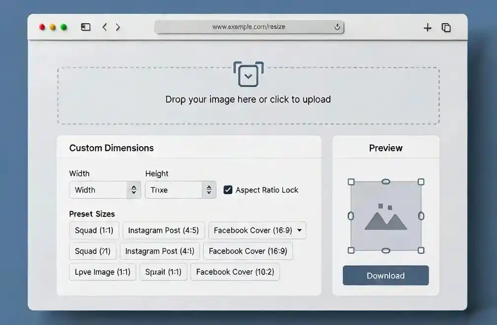
Our Resize Image tool is packed with high-end features that cater to both beginners and power users. The “Aspect Ratio Lock” is perhaps the most essential feature. It ensures that when you change the width, the height adjusts automatically to prevent the image from looking “stretched” or “squashed.” This mathematical precision is vital for maintaining the original artistic intent of your photography or design work.
We have also included a suite of “Social Media Presets.” Instead of memorizing the exact dimensions for an Instagram post or a YouTube thumbnail, you can simply select the option from our dropdown menu. This saves time and ensures that your content meets the strict requirements of major platforms. If your image requires specific framing, our Crop Image tool is available to help you focus on the most important subject matter before you scale it.
Step-by-Step Guide to Resizing
To Resize Image files effectively, start by selecting your file through the drag-and-drop box or the file picker. Once the image is loaded into your browser’s memory, you will see its original dimensions. This information is crucial for deciding how much you need to scale. We recommend always starting with the highest resolution original available to avoid “pixelation” when enlarging, although shrinking is generally more common for web use.
Next, enter your desired width or height. If the aspect ratio lock is enabled, you only need to change one value. Alternatively, use the percentage selector to quickly drop the size to 50% or 25% of the original. Once you are satisfied with the preview, hit the “Download” button. For developers who need to use images directly in code, we also offer an Image to Base64 converter to simplify your CSS and HTML implementation.
The Benefits of Professional Scaling
When you Resize Image files professionally, you enhance the accessibility of your content. Smaller images load faster on slow 3G or 4G networks, ensuring that users in regions with poor connectivity can still access your information. This commitment to performance is a sign of a truly user-centric digital strategy. Furthermore, using the correct dimensions prevents layout shifts, which is a major part of the “Cumulative Layout Shift” (CLS) metric in SEO.
Privacy is another overlooked benefit. Because our tool works client-side, your sensitive company documents or personal photos never touch a remote server. This eliminates the risk of data breaches or unauthorized access to your visual assets. If you are preparing images for a sensitive report, you might also find our Blur and Censor Image tool useful for protecting faces or confidential text before you export the final resized version.
Image Size Recommendations
Understanding the landscape of social media is key when you Resize Image content for marketing. Every platform has its own algorithm that favors specific ratios. For example, Instagram prefers 1080×1080 for square posts and 1080×1350 for portrait. Using our presets ensures that your images are not automatically cropped by the social platform’s interface, which can often cut out vital information like your logo or call-to-action.
For bloggers and website owners, we recommend a standard width of 1200 pixels for hero sections and 800 pixels for standard article images. If you are converting formats for better compatibility, use our PNG to JPG or JPG to PNG converters. These tools help you balance quality and transparency requirements for different parts of your website UI.
Optimizing Your Design Workflow
A productive designer doesn’t just Resize Image assets; they build a full visual system. This involves picking the right colors and maintaining a cohesive palette. After you’ve scaled your main product shot, try our Image Color Picker to extract the primary hex codes for your website’s buttons and accents. This synergy between tools creates a professional “SaaS” look that users trust.
If you are creating brand guidelines, you can also use our Color Palette Generator or the Average Color Finder. These utilities allow you to maintain visual harmony across multiple pages and social channels. Scaling is just the foundation; the true impact comes from how you integrate those resized images into a wider, more thoughtful design strategy.
Use Cases Across Different Industries
In the academic world, students often need to Resize Image files for lab reports or digital submissions. University portals often have strict file size limits (like 2MB). By scaling down massive diagrams or microscope photos, students can ensure their assignments are accepted without sacrificing the clarity needed for grading. This allows for a smooth academic workflow without technical hurdles.
For real estate agents, high-quality photos are essential for listings. However, uploading 20 high-res DSLR photos to a property portal can take an eternity. By using our tool to Resize Image files to 1920×1080, agents can maintain high quality while speeding up the listing process significantly. This efficiency translates to more time spent with clients and less time waiting for progress bars to finish.
In the world of E-commerce, product image uniformity is king. Customers find it jarring when one product photo is small and the next is huge. Using a tool to Resize Image all your inventory shots to a standard 1:1 ratio ensures a clean, organized “Amazon-like” shopping experience. This uniformity has been proven to increase conversion rates and build consumer confidence in the brand’s attention to detail.
Frequently Asked Questions
Does resizing reduce image quality?
When you Resize Image files by making them smaller, you are effectively condensing pixel data. This usually makes the image look sharper. However, enlarging a small image can cause blurriness or “pixelation” because the software has to “guess” the missing data. We recommend always starting with the highest possible resolution original.
Can I resize multiple images at once?
Our current tool is optimized for high-quality individual processing to ensure accuracy. This allow you to Resize Image files one by one with specific settings for each. For bulk actions, we recommend using dedicated desktop software, although our tool is fast enough for quick sequential updates.
What is the “Aspect Ratio” and why lock it?
Aspect ratio is the relationship between width and height (e.g., 16:9 or 4:3). When you Resize Image content, locking the ratio prevents distortion. If you change a square image (1:1) to a wide rectangle without locking the ratio, the subject will appear flattened. Locking ensures the proportions remain natural.
Which format is best for web performance?
WEBP is currently the best format for the modern web. When you Resize Image assets, saving them as WEBP can reduce file size by up to 30% compared to JPG without losing quality. Our tool supports reading and outputting high-quality versions of all these common formats.
Final Thoughts on Image Scaling
Mastering the ability to Resize Image files is a superpower in the digital economy. It allows you to control your brand’s narrative, optimize your site’s performance, and provide a better experience for your users. We have built this tool to be the simplest, fastest, and most secure solution available on the internet. By removing the need for server-side processing, we give you absolute control over your visual assets.
We invite you to explore the rest of the PixaPDF toolkit to further enhance your digital workflow. From document conversion to advanced image manipulation, our mission is to provide professional-grade tools at zero cost to the community. Bookmark this Resize Image utility today and never let a massive photo slow down your digital dreams again. Happy designing!