
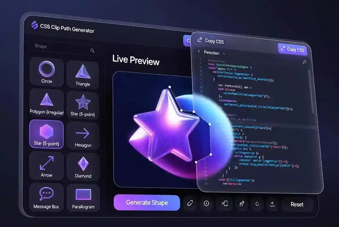
CSS Clip Path Generator 50+ Custom Shape Creator Tool
CSS Clip Path Generator is an essential design utility for web developers seeking to break away from boxy layouts. Traditionally, web elements are restricted to rectangles, but modern CSS standards allow us to create intricate geometries. Our tool provides a seamless visual experience, allowing you to select from over 50 predefined shapes and export the code instantly for your projects.
What is the CSS Clip Path Generator?
The CSS Clip Path Generator is a powerful tool designed to help you create complex shapes using CSS properties. In the past, creating non-rectangular shapes required using transparent PNG images or SVG files. While those methods still work, they often add weight to the page load and require additional HTTP requests.
With clipping, you define a region of an element that should remain visible, while everything else is hidden. It is similar to looking through a keyhole. This method is highly performant because it relies on the browser’s native rendering engine. If you’ve used our glassmorphism CSS generator, you know how important shapes are for visual depth.
Understanding the math behind polygons can be difficult for beginners. Instead of manually calculating X and Y coordinates, this visual tool allows you to see the shape immediately. Whether you need a simple triangle or a complex 20-point star, the generator handles the complex coordinate system for you.
Key Features of the Shape Creator
Our CSS Clip Path Generator includes an extensive library of 50+ unique shapes. We categorized them into basic geometric forms, directional symbols, and decorative elements. This diversity ensures that no matter what kind of UI you are building, you can find a suitable mask without hassle.
The selection includes standard forms like circles and ellipses, but also fun shapes like hearts, message bubbles, and various arrows. Grouping shapes this way makes it faster to find the right mask when you already know the category you need, rather than scrolling past dozens of unrelated options.
Real-time code output is perhaps the most useful feature. As you click on different buttons in the shape panel, the CSS string below the preview updates instantly. This eliminates errors that typically occur when copying coordinates by hand from a design tool like Figma or Photoshop.
Benefits for Designers and Developers
Speed is the primary benefit when using the CSS Clip Path Generator. Time saved in the development phase translates to faster project delivery. Instead of spending 20 minutes tweaking a polygon point, you get it done in 2 seconds with a single click. This efficiency is critical for modern agile environments.
Another benefit is scalability. Because CSS shapes are mathematical, they look crisp on any screen resolution. Whether your user is on a 4K monitor or a small mobile device, the clip-path will render perfectly. This is vital for mobile-first design where screen real estate is limited and clarity is everything.
Responsive design becomes easier when you combine this tool with our other generators. For instance, pairing clipped images with a CSS gradient generator backdrop creates a high-end SaaS aesthetic. It allows you to build interfaces that feel premium and custom-built.
CSS Clip Path Generator Step-by-Step Usage Guide
Using the CSS Clip Path Generator is straightforward. First, browse the shape selection panel on the left side of the tool. We have included 50+ options to give you maximum creative freedom. Once you find a shape you like, click on it to see it applied to the central preview box.
Second, review the live CSS code generated in the dark text box. It will typically use the clip-path: polygon(...) or clip-path: circle(...) syntax. You can click the “Copy CSS” button to save it to your clipboard. This is much faster than highlighting and right-clicking manually.
If you want to try something different, use the “Random Shape” button. This is a great way to discover new design directions you might not have considered, and clicking through several options in a row often reveals a shape that fits your layout better than the one you originally had in mind.
CSS Clip Path Generator Real-world Shape Examples
The CSS Clip Path Generator excels at creating functional UI components. For example, a “Message Box” shape is perfect for chat applications or notification popups. Instead of using a background image, you can apply the clip-path to a simple <div> and achieve a perfectly responsive speech bubble.
Another popular use case is the “Arrow” shape. Arrows are frequently used in navigation menus and progress trackers. By using CSS clipping, you can easily change the color of the arrow using the background-color property without having to export new assets from a graphic design program.
Geometric shapes like hexagons and octagons are great for team member profile pictures. Using a CSS border radius generator is good for soft corners, but for sharp geometric masks, the clip-path property is much more effective and versatile.
SEO and Performance Impact
Google loves fast websites. Using the CSS Clip Path Generator helps improve your Core Web Vitals by reducing the amount of image data being sent to the browser. Every kilobyte saved contributes to a better Largest Contentful Paint (LCP) score, which is a significant ranking factor in modern search results.
Furthermore, since clip-paths are text-based in your CSS files, they compress extremely well under standard gzip or Brotli compression, unlike a raster PNG mask which is already compressed and gains little from server-side compression. For the web, keeping a shape in pure CSS rather than an image is the more bandwidth-efficient choice almost every time.
Accessible design is also an SEO factor. Unlike images where you need alt-tags for accessibility, CSS shapes are applied to elements that already contain text or roles. This makes the content readable by screen readers while still maintaining a beautiful visual layout for sighted users.
Advanced Techniques with Clip Paths
Once you master the CSS Clip Path Generator, you can begin to layer shapes. You can place one clipped element on top of another to create complex “knockout” effects. This is often used in modern hero sections to create a sense of depth and motion without using heavy video files.
You can also animate these shapes using CSS transitions. Since the coordinates are numbers, browsers can interpolate the movement between two different polygons. This allows for morphing effects where a circle turns into a square on hover. Check out the MDN Web Docs on clip-path for detailed animation syntax.
Combining clip paths with shadows is a bit tricky, as standard box-shadow follows the element box, not the clip. You can overcome this by using the filter: drop-shadow() property. This ensures that the shadow follows the contours of the custom shape you created with our tool.
CSS Clip Path Generator Improving Your Design Workflow
Incorporating the CSS Clip Path Generator into your daily workflow saves hours of manual labor. Most developers have a “toolbox” of bookmarks for common tasks. This tool should be at the top of that list. Whether you are building a landing page or a complex dashboard, shapes make the UI feel unique.
If your project’s CSS grows cluttered with shape definitions, group related clip-path values together in a dedicated partial file, such as _shapes.css, rather than scattering them through component files. This makes it much easier for a teammate to find and reuse an existing shape instead of generating a near-identical one from scratch.
Naming your shape classes by what they represent, such as .shape-badge or .shape-ribbon, rather than by their geometry, such as .hexagon-2, also pays off over time. A name tied to intent survives a redesign even if the underlying polygon coordinates change, while a name tied to shape breaks the moment the design updates.
CSS Clip Path Generator: Masking vs. Clipping
While the CSS Clip Path Generator focuses on clipping, it is important to know the difference from masking. Clipping is binary; a pixel is either inside the shape or outside. Masking allows for varying levels of transparency using alpha channels or luminance values, often using SVG images as the mask source.
Clipping is usually faster and easier to implement for geometric shapes. Masking is better for complex textures like smoke or paint splatters. For 90% of web design needs, clipping polygons is the most efficient and cross-browser compatible choice. You can learn more at CSS-Tricks, which is a high-authority resource for frontend engineers.
A quick way to decide between the two: if you can describe the shape as a list of straight-edged points, reach for clip-path polygon. If you’re describing something with soft, uneven edges, like a torn paper effect or an ink blot, masking with an SVG or PNG source is going to get you there faster than fighting the polygon function.
CSS Clip Path Generator Shapes in Navigation and Progress UI
The CSS Clip Path Generator’s directional shapes earn their keep most clearly in navigation. A “chevron” or arrow clip-path makes a natural next/previous button, a breadcrumb separator, or a step indicator in a multi-stage form, and because it’s pure CSS, you can recolor it instantly with background-color rather than swapping an image asset for every state (default, hover, active, disabled).
Progress trackers benefit from the same idea. A row of pennant or arrow shapes, each one filled in as the user completes a step, communicates forward motion far more clearly than a plain progress bar. Because the shapes share one clip-path definition, updating the design later means changing one value instead of hunting down several icon files.
Tab bars and segmented controls can also use a subtle angled clip-path on the active tab to create a sense of depth without adding a drop shadow or border, which keeps the component visually light even when several tabs sit side by side.
Driving CSS Clip Path Generator Output with Custom Properties
Hardcoding a shape’s coordinates directly in every selector makes it painful to reuse or tweak later. Storing the value in a CSS custom property, such as --shape-badge: polygon(50% 0%, 100% 25%, 100% 75%, 50% 100%, 0% 75%, 0% 25%);, lets you apply the same shape to multiple elements with clip-path: var(--shape-badge); and update every instance from one place.
This also opens the door to theming. A custom property can be redefined inside a media query or a dark-mode class, swapping a sharp geometric badge for a softer rounded one without touching the component markup at all. It’s a small habit, but it turns a one-off clip-path from this generator into a reusable design-system token rather than a copy-pasted value scattered across files.
The Future of Web Polygons
The CSS Clip Path Generator is built to adapt to future CSS standards. As browsers implement new functions like path(), we will update our library. The path() function allows for even more organic, free-form curves similar to those found in SVG path data. This will revolutionize how we think about web layouts.
Currently, the polygon() function remains the most widely supported. It allows you to specify a list of coordinates, connecting them with straight lines. By using many points close together, you can even simulate curves. However, for true circles, the circle() and ellipse() functions remain the superior choices for performance.
Browser support for path() is already solid in Chromium and Firefox, with Safari catching up, so it’s reasonable to start planning for it now even while polygon() remains the safer default for production work today.
Maintaining Design Consistency With the CSS Clip Path Generator
Consistency is key to a professional UI. Once you generate a shape with our CSS Clip Path Generator, you should document its use in your project’s CSS variables or design system. This ensures that every developer on the team uses the exact same coordinates for recurring elements like buttons or icons.
Write a short comment above each custom clip-path value explaining what it’s for, such as /* badge on pricing card */. It sounds trivial, but six months later, a bare coordinate list means nothing to anyone, while a one-line comment saves the next developer from having to reverse-engineer the shape’s purpose from the rendered page.
Because clip-path coordinates are almost always written as percentages, it helps to know the container’s own width-to-height ratio before generating a shape for it. A polygon tuned for a square card will look stretched or squashed inside a wide banner, so match the aspect ratio of your preview to the aspect ratio of the real component before locking in a shape.
Responsive Shapes Across Screen Sizes
Clip-paths defined with percentage values scale naturally with their container, but that scaling is not always what you expect. A complex polygon that looks balanced on a desktop monitor might appear squashed or stretched on a vertical phone screen. The aspect ratio of the element matters just as much as the clip-path coordinates themselves. The CSS Clip Path Generator outputs percentage-based values, but testing those values across breakpoints is essential for production-quality results.
One technique is to use different clip-paths for different breakpoints via media queries. A speech bubble that works at 300 pixels wide might need its tail repositioned at 600 pixels wide. Rather than fighting a single shape to work everywhere, generate multiple variants with the CSS Clip Path Generator and swap them at appropriate breakpoints. This gives you pixel-perfect control without sacrificing responsiveness.
Container queries offer even finer control than media queries. Instead of basing the shape on viewport width, you base it on the element’s own container width. This is ideal for card layouts where the same component appears in narrow sidebars and wide main content areas. The CSS Clip Path Generator helps you create the base shapes, and container queries handle the contextual adaptation.
Animating Between Shapes with CSS Transitions
One of the most visually striking effects in modern CSS is shape morphing. Because clip-path coordinates are numerical values, browsers can interpolate between two different polygons during a transition. A triangle can smoothly morph into a circle, or a star can expand into a hexagon. The CSS Clip Path Generator gives you the starting and ending coordinates; you provide the transition timing.
The key rule for smooth morphing is that both shapes must have the same number of points. A triangle with three vertices cannot directly morph into a star with ten vertices. To work around this, duplicate points in the simpler shape until the count matches. The CSS Clip Path Generator helps you plan this by showing the coordinate count for each shape, letting you choose compatible pairs for animation.
Timing functions matter more than you might think. A linear transition feels mechanical. An ease-in-out curve feels organic. For dramatic reveals, try a cubic-bezier with an overshoot that makes the shape bounce slightly past its final form before settling. The CSS Clip Path Generator produces the static coordinates, but the animation personality comes from your CSS transition declarations.
Using Clip Paths with Photographic Content
Clipping photographs into CSS Clip Path Generator shapes is a popular editorial technique. A portrait inside a circle is classic. A landscape inside a slanted parallelogram feels dynamic. The CSS Clip Path Generator makes these effects trivial to implement, but the choice of photograph matters enormously. Faces near the edge of a frame might get cut off by aggressive clipping. Busy backgrounds might compete with the shape boundary.
Composition adjustments are often necessary. When you know a photo will be clipped into a hexagon, shoot or crop with that hexagon in mind. Keep the subject centered with enough padding around the edges. The CSS Clip Path Generator shows a preview with a gradient background, but your real content will behave differently. Test with actual images before committing to a layout.
Object-fit and object-position work alongside clip-path to control how the image fills the shaped container. A clipped image that uses object-fit cover fills the entire shape while maintaining aspect ratio. Object-position lets you shift the focal point within the shape. These three properties together, clip-path, object-fit, and object-position, give you complete control over photographic shapes.
Shaping Text Containers for Editorial Layouts
Clip-paths are not limited to images. They work on any block-level element, including text containers. A pull quote clipped into a diamond shape breaks the rectangular rhythm of a long article. A sidebar clipped with a subtle angle adds energy to an otherwise static layout. The CSS Clip Path Generator helps you find shapes that complement your typography rather than fighting it.
Text flow inside clipped containers follows the original box boundaries, not the visible shape. This means padding and line length calculations use the full rectangle, not just the visible portion. For diagonal shapes, this can create awkward spacing where text appears too close to the invisible edge. Adjust padding generously and test with real content, not just placeholder text.
Line height and font size affect how text looks inside shapes. Tight shapes with dense text feel cramped. Generous shapes with sparse text feel empty. This tool hands you the outline shape; matching it to a typographic scale that reads comfortably is a separate design decision. A good rule is to increase line height by ten to fifteen percent inside clipped containers to compensate for the irregular boundaries.
Combining Clip Paths with CSS Gradients
A clipped element with a solid background is just the beginning. Adding a linear or radial gradient inside the shape creates depth and movement. A hexagon with a gradient that shifts from warm to cool colors feels like a gemstone. A circle with a conic gradient feels like a dial or gauge. Pair the outline this tool draws with our CSS gradient generator for the fill, and the two together do the rest of the work.
Gradient angles interact interestingly with shape angles. A diagonal gradient inside a parallelogram can either reinforce the slant or contradict it, depending on the angle you choose. Reinforcement creates harmony. Contradiction creates tension. Both are valid design choices, but they must be intentional. Use the CSS Clip Path Generator to visualize the shape, then experiment with gradient angles until the relationship feels right.
Animated gradients inside clipped shapes are increasingly popular. A button with a slowly shifting gradient inside a pill shape catches the eye without demanding attention. The CSS Clip Path Generator creates the pill outline, and CSS animation moves the gradient position. The combination feels alive and modern without the performance cost of JavaScript-driven effects.
When to Choose SVG Over CSS Clip Paths
CSS clip-paths are powerful but not universal. For truly organic shapes, like hand-drawn blobs or intricate illustrations, SVG remains the better choice. SVG paths support bezier curves that CSS polygons cannot replicate. The CSS Clip Path Generator excels at geometric shapes with straight edges, but it cannot produce fluid, organic contours. Knowing the boundary between these technologies saves you from frustrating limitations.
SVG also wins when you need strokes or borders that follow the shape contour. As noted earlier, CSS borders follow the rectangular box, not the clipped shape. SVG strokes follow the actual path. If your design requires a visible outline around a complex shape, use SVG instead of CSS clip-path. The CSS Clip Path Generator is for masking and layout, not for illustrated graphics.
Browser support differs slightly between the two. SVG clip-path has been supported longer and more consistently across older browsers. CSS clip-path is well-supported now but had gaps in older Safari versions. For enterprise applications with legacy browser requirements, SVG might be the safer choice. For modern consumer-facing sites, CSS clip-path is perfectly reliable.
Performance and Rendering Optimization
Clip-paths are generally fast, but complex polygons with many points can slow down rendering during scroll or resize. Each point adds to the browser’s calculation workload. The CSS Clip Path Generator includes shapes ranging from three points to over twenty. For high-performance contexts like infinite scroll lists, prefer simpler shapes with fewer vertices.
Repaints are another consideration. When a clipped element changes, the browser must recalculate the visible region. If many clipped elements animate simultaneously, the paint cost adds up. Use the will-change property sparingly on clipped elements that are about to animate, and remove it after the animation completes. This hints to the browser to optimize the layer without permanently consuming memory.
Hardware acceleration helps. Applying a 3D transform like translateZ(0) forces the browser to promote the clipped element to its own compositor layer. This isolates the clip-path rendering from the rest of the page, reducing jank during scroll. The shape code comes from this tool; squeezing extra performance out of it is a separate step you add in your own stylesheet.
Accessibility Considerations for Non-Rectangular Layouts
Screen readers do not care about shapes from the CSS Clip Path Generator. They read the content inside the element regardless of its visible shape. This is generally good, but it can create confusion if the visual order differs from the DOM order. A diagonal layout where elements appear top-to-bottom visually but left-to-right in the DOM will disorient keyboard users. Generating the visual shape is only half the job; checking that the tab order still matches what a sighted user sees on screen is a manual step this tool can’t do for you.
Focus indicators also need attention. The default browser focus ring is rectangular, which looks odd around a clipped shape. Custom focus styles using outline or box-shadow can follow the element’s box, not the clip. Consider using a visible label or background change instead of an outline for clipped interactive elements. Building the shape is what this tool is for; deciding how a focused element should announce itself visually is a call only you can make for your specific interface.
Color contrast applies to the full element, not just the visible portion. Even pixels hidden by the clip-path must meet contrast requirements if they contain text. This rarely causes issues, but it is worth checking with a contrast analyzer when using aggressive clipping that hides significant portions of the background. Treat what you build here as the starting shape, and run it through an accessibility checker before shipping, the same way you would any other visual element.
Frequently Asked Questions
What is the difference between clip-path and border-radius?
Border-radius is used to round the corners of an element’s box. Clip-path is used to create complex geometries by hiding parts of the element. While you can use a CSS Clip Path Generator to make a circle, a simple CSS border radius generator is often more efficient for that specific task.
Can I add a border to a clipped shape?
Directly adding border to a clipped element usually doesn’t work because the border is also clipped. To achieve a border effect, you should wrap the clipped element in a slightly larger clipped element with a different background color, or use SVG filters.
Is clip-path supported by all browsers?
Most modern browsers like Chrome, Firefox, Edge, and Safari have excellent support. For older versions of Safari, you might still need the -webkit- prefix. Our CSS Clip Path Generator provides code that is generally compatible with all evergreen browsers.
How do I create a custom shape?
You can use the polygon function to define custom vertices. Each point consists of two percentages (X and Y). If you need help with the math, our CSS Clip Path Generator simplifies the process by letting you pick from 50+ templates that you can then modify.
Final Thoughts on Modern UI Design
The CSS Clip Path Generator is a gateway to a more creative and engaging web. By mastering shapes, you elevate your skill set from a standard developer to a visual architect. We encourage you to experiment with different combinations, gradients, and animations to see what unique experiences you can build.
Remember that design is not just about how it looks, but also about how it performs. By using CSS clipping instead of heavy images, you are building a faster, more accessible web. We invite you to explore our other tools, such as the CSS box shadow generator, to add even more depth to your clipped shapes.
Thank you for choosing our platform for your design needs. We are committed to providing the best free tools for the developer community, and we hope this generator becomes a regular part of your CSS workflow. Happy designing!
For further learning on web layout trends, visit Smashing Magazine or web.dev. Both are high-authority resources that provide deep insights into modern frontend standards and best practices.