
Image Color Picker: Fast, One-Click Hex Code Tool
Click or Drop Image Here
To start picking colors
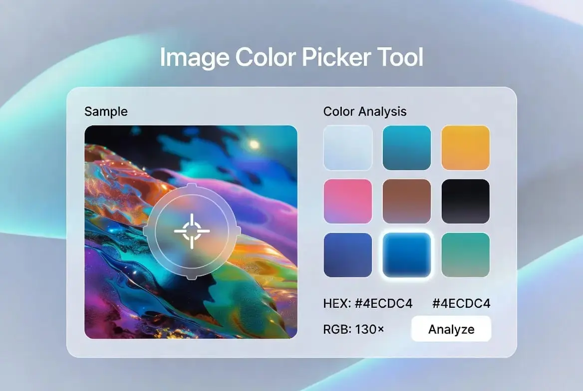
Click anywhere on the image to pick a specific color. Use “Get Palette” to extract all dominant colors.
What This Image Color Picker Does
An Image Color Picker reads the exact color value at a single point in an image, which is what makes this Image Color Picker useful, instead of leaving you to guess a shade by eye. Upload a photo, click on any pixel, and you get its precise hex and RGB values in under a second. Designers, developers, and anyone matching a color to a reference image use this kind of tool constantly.
Everything here runs in your browser: no upload to a server, no waiting. If you want a full set of colors pulled from an image rather than a single point, the Color Palette Generator is the better fit.
How This Image Color Picker Actually Works
The tool draws your uploaded image onto an HTML canvas, which is a part of the browser that can read the color value of any single pixel through the Canvas API. When you click, it reads the red, green, blue, and alpha value at that exact coordinate and converts it straight into a hex code.
Very large images can slow this down simply because there’s more data to read. If a file feels sluggish, running it through the Image Compressor first usually fixes it without any visible loss in the colors themselves.
Why Two Colors Can “Weigh” the Same but Look Different
RGB values alone don’t fully capture how bright a color looks to the human eye. A bright yellow and a deep violet can sit at a similar numerical distance from black, yet yellow reads as much lighter to us. This is why a picked color can occasionally look slightly different on screen than the hex code alone would suggest, since perceived brightness and mathematical distance aren’t quite the same thing.
In practice this rarely matters for everyday picking, but it’s useful context if a sampled color ever looks a shade “off” compared to what you expected from the source photo.
Why Designers Reach for an Image Color Picker
Pulling a button color or an accent shade directly from a hero photo, rather than eyeballing something close, keeps a design feeling intentional instead of slightly mismatched. If the background behind your subject is distracting the sample, running the photo through the Background Remover first gives you a cleaner area to pick from.
It’s also useful for logo and brand work when a client only has a low-resolution reference image. Sampling the exact color from what you’ve got is faster and more accurate than trying to match it from memory or a rough guess.
Using an Image Color Picker for Interface Design
A common interface pattern is pulling an accent color from whatever content is currently on screen, an album cover, a product photo, a header image, so the surrounding UI feels tied to the content instead of sitting on a fixed palette. Sampling a color this way with this tool gives you the exact number to plug into your CSS rather than approximating it.
For teams embedding small image assets directly into stylesheets, pairing this with the Image to Base64 converter cuts down on extra server requests for tiny graphics.
Using an Image Color Picker for Accessibility Checks
Text readability depends heavily on contrast against its background, and WCAG guidelines set a minimum ratio of 4.5:1 for normal body text. Picking the exact background color behind a piece of text is the first step in checking that ratio properly instead of guessing whether it “looks fine.”
If a background photo is too busy for text to sit on comfortably, the Blur Censor Image tool can soften it first, after which you can pick a calmer, more uniform shade from the blurred area.
Using an Image Color Picker to Keep Brand Colors Consistent
When the same shade of blue needs to show up identically across a website, a social post, and a printed flyer, sampling it directly from an approved brand asset each time avoids the slow color drift that happens when everyone eyeballs “close enough.” Marketing and design teams use this to catch a mismatched shade before it ships rather than after.
Your Images Stay on Your Device
Nothing you upload here is sent to a server. The image is read and processed entirely in your browser using the Canvas API described earlier, which also means there’s no upload wait before you can start picking colors.
An Image Color Picker Faster Than Opening Design Software
Opening a full image editor just to grab one hex code is a lot of overhead for a quick task. Keeping this tool open in a browser tab is faster for the small, frequent checks: confirming a shade before a meeting, matching a color across two files, or double-checking a client’s reference image.
Everyday Situations Where an Image Color Picker Helps
You’re scrolling through a photo from last summer and the sky is exactly the blue you need for a project. Upload it, click the sky, and the hex code is ready in a second, no swatch books involved.
Interior designers do the same with a photo of fabric or paint chips, pulling the exact shade to send to a supplier instead of hoping the supplier’s swatch matches what’s in the photo. Fashion and lifestyle content creators use it to pull dominant tones from an outfit photo for banners and story backgrounds that visually tie back to the original shot.
How Developers Use This Image Color Picker
A product that ships in twelve colors but only has photos, not a color list, is a common headache. Instead of typing hex codes by hand and risking a typo, a developer can click each swatch in the product photo and copy the values straight into CSS or a database.
Game developers use the same idea for texture work, sampling real photos of brick, metal, or wood so in-game surfaces are built on colors that came from something real rather than a flat digital guess. Teams building a dark mode also use it to check exactly how dark a background can go before text on top of it becomes hard to read.
An Image Color Picker as a Photo Editing Shortcut
Color grading by feel alone can take a long time to land on the right mood. Picking the shadow, midtone, and highlight values from a reference photo you like turns a vague idea into three concrete numbers you can plug straight into a grading panel.
Photographers working through a large gallery use the same anchor points across every photo in the set so the whole album feels like one continuous edit rather than a pile of separately-tweaked images. It’s also a useful reality check: picking the actual wall color in a real estate photo and comparing it to the edited version quickly shows if saturation has been pushed too far.
Using an Image Color Picker to Bridge Screen and Print
Screens mix color with light (RGB); printers lay down ink (CMYK), and the two don’t always agree on what a color should look like. A bright neon shade that looks great on a monitor can turn muddy once it’s printed. Picking the exact screen RGB value first, then converting it through a proper color profile, gives a print shop or a color lab a real starting point instead of a rough approximation.
Screen printers working with a limited number of ink colors use the same approach in reverse: sample the artwork, identify the handful of colors that actually matter, and plan the print run around those specific values rather than guessing at the file’s overall palette.
This Image Color Picker as an Input for Other Tools
Some image classification and style-matching systems need raw color values as a starting input, and picking or sampling colors is often the first manual step before that data gets fed into anything automated. If you’re building or testing a system like that, having a fast way to sample and verify individual pixel values by hand is useful for spot-checking that the automated extraction is behaving the way you expect.
Getting a More Reliable Result From an Image Color Picker
Always sample from the highest-resolution version of an image you have access to. Heavy compression introduces small color shifts, so a pixel that reads slightly green in a compressed JPEG might genuinely be closer to teal in the original file.
Keep in mind that the same hex code can look slightly different across two uncalibrated monitors, so for anything where color accuracy really matters, treat the picked hex value as the source of truth rather than how it happens to render on your specific screen. For a symmetrical subject, the center-pick option is often the fastest way to land on the most representative tone without hunting for the right spot manually.
Hex, RGB, and HSL: Reading Image Color Picker Output
This tool shows a picked color two ways: as a hex code like #3B82F6 and as RGB numbers like rgb(59, 130, 246). Both describe the exact same color; they’re just written for different audiences. Hex is the shorthand most common in CSS and design tools, packing the red, green, and blue values into a single six-character code. RGB spells the same three numbers out individually, which is often easier to read when you’re adjusting one channel at a time, such as nudging a color slightly bluer without changing anything else.
You’ll also come across HSL in some design software, which describes a color by hue, saturation, and lightness instead of by channel. It’s a different way of expressing the same underlying color, and it’s often more intuitive for tasks like “make this a bit darker” or “make this less saturated,” since those are direct dial adjustments in HSL rather than a recalculation across three separate RGB numbers. If a tool you’re using only accepts one format, converting between hex, RGB, and HSL is a solved problem; most design software and many free converters handle it instantly once you have the hex code from a pick.
Troubleshooting an Image Color Picker Result
Occasionally a picked hex code from an Image Color Picker will look slightly different than expected once it’s placed somewhere else, like a website background or a printed swatch. Before assuming the tool made a mistake, it’s worth checking a few likely causes. The most common one is simply comparing colors on two different screens; an uncalibrated monitor can shift how any color renders, so the same hex code can look warmer or cooler depending on the display.
Another cause is picking from a heavily compressed image. JPEG compression in particular can introduce small color shifts around edges and in areas with fine detail, so a pixel sampled near a hard edge might read slightly differently than the same area in an uncompressed version of the photo. Picking from a flatter, more uniform part of the image, or from a higher-quality source file when one is available, usually gives a more representative result.
If a color looks right on screen but wrong once printed, that’s expected rather than a bug: screens and printers use fundamentally different color systems, and a hex code alone doesn’t carry enough information to guarantee an exact print match without going through a proper color profile first. In all of these cases, the number the tool gives you is accurate to the pixel it read; what changes is how faithfully that number gets reproduced by whatever comes next in your workflow.
Building a Color Scheme From One Image Color Picker Pick
A single picked color is often just the starting point. Complementary colors sit opposite each other on the color wheel and create strong contrast; analogous colors sit close together and feel calmer; a triadic set spaced evenly around the wheel gives balance with a bit more energy than analogous pairings. Once you have one solid hex code from this tool, building the rest of a scheme around it becomes a matter of following one of these relationships rather than guessing.
Why an Image Color Picker Hex Code Can Look Different Everywhere
A color that looks right on one phone can look slightly washed out on a cheaper display, since different screens don’t all cover the same color range. Printing adds another layer of difference on top of that, and image compression on social platforms can shift a color again after you’ve already published it. None of that means the picked hex code is wrong; it just means the same number can render a little differently depending on where it ends up, which is worth checking for anything brand-critical.
Using an Image Color Picker to Teach Color Concepts
Turning color theory into an actual number makes it easier to grasp. Having a class pick colors from paintings and compare the hex values is a concrete way to talk about warm versus cool tones or how value shifts across a composition, instead of describing it only in the abstract.
Frequently Asked Questions
How accurate is this Image Color Picker?
It reads the exact pixel data from the image as rendered in your browser, so the hex and RGB values are as accurate as the source image itself.
Can I pick colors from a GIF?
Yes. The first frame of an animated GIF is what gets loaded, and you can pick any color from that frame.
Does it work on mobile phones?
Yes, the layout and touch interaction both work on phones and tablets as well as desktop browsers.
Is there a limit to image size?
There’s no hard limit for this Image Color Picker, but a very large file, over roughly 50MB, can slow your browser down. Compressing the image first usually solves that without visibly changing its colors.
Are my images stored on your server?
No. Everything is processed locally in your browser, and nothing is ever uploaded anywhere.